This has been a slow summer for photography. At least for processing them. I have been out shooting, although not as much as I usually do, but I haven’t been at the computer at all. Anyway, what did happen with my Lightroom breakup? I ended up going for DXO Photolab. Version 7 at the moment, but I do have a trial for version 8 installed now. I’m not sure yet. Still 29 days to go. The other big thing is that I try to integrate DigiKam as my library tool. It is quite powerful, and if JPG was all you did, you could just use it stand alone. It does maps, face recognition, scene recognition and all that stuff, and it is quite nice for browsing, sorting and keywording.
The LightRoom replacement is not as easy as I hoped it would be. All alternatives are lacking. In fact, so is LightRoom in its own way, but I am used to that so I don’t notice as much. Also It is not easy to predict which shortcomings I can live with, and which will drive me mad.
CaptureOne: Seemed like a good alternative, and in many ways it is. But there are also drawback to it.
Good stuff:
Excellent DAM when using it in catalog mode (with referenced images)
I really like how projects work, and how smart albums are contained within.
Smooth interface
Good for culling and rating images
Nice local adjustments using layers and a fairly good masking tool
Not so good:
Shitty Raw processor.
Noise reduction is a joke
Lots of little snags and hickups (becomes unresponsive now and again)
A bit outdated. They don’t develop modern features very fast.
Expensive.
DXO Photolab: This very different to C1. All the features that are good in PL is bad in C1, and visa versa.
Good stuff:
The best Raw processor
The best noise reduction
The best lens correction
Some very nice modern processing features for exposure and dehaze
Ok local adjustments. No AI masking, but for what they are, the masking tools work pretty well.
Pricing and licensing
Not so good:
DAM and organizing is terrible.
It uses a sort of database, but it is rather brittle.
You can’t see pictures in sub folders when browsing.
Undo doesn’t work very good.
Conclusion
So, is there a conclusion to all this. Not yet. I still have 22 days left on the trial versions. For many reasons, not all of the technical, I tend to prefer DXO, but I need to sort out a few workflow issues first. Mainly related to organizing the images. I don’t think I can trust the database, which also holds the collections. It would be a real drag if I have to dump and rebuild the index. I may want to use keywords to embed all this information in the sidecar files. In that way, it will be more future proof as I can reconstruct even if I change the software in the future.
I just flipped the table over, screamed and yelled at everyone around and ran out of the room. Metaphorically speaking. I just stopped my Adobe subscription.
Even though LightRoom is fairly priced, and technically very good, I really don’t like Adobe. This has been brewing for many years now, and when they recently changed their end user agreement, I had enough. Event though it doesn’t really matter to me since I don’t store anything in the cloud, I think it is wrong to grab the rights to all their customers content the way they have done now. So I told them the only way I know, with my wallet.
I have used LightRoom ever since version 1. I did have a short run with Aperture, but that product was discontinued, and not long after I flipped the Apple-table and rage-quit that ecosystem due to Apples hostility towards repairs. So now I’m in the marked for a new DAM and Raw processor. I have looked at most, and I really wished there would be a decent alternative for Linux, but there isn’t. Darktable and RawTherapee doesn’t cut it for me. Currently I am down to 3 alternatives. On1 Photo Raw, DXO Photolab and CaptureOne. Not sure what I’ll end up with yet.
This winter has been hard. I’m not a fan of snow and winter by any stretch, but this one got to me worse than ever before. So much snow. Anyway, days are getting longer and the snow is melting so it’s getting better every day.
I finally gave int to the Fujifilm X100 hype. Not the latest model VI, but a used X100V. Much cheaper, and just as good for my use. It’s a fun camera to use, but my reasons are a bit different than many. I don’t do film simulations. Not in camera at least. I shoot RAW, and do whatever it takes after the fact. I like this camera because of the optical viewfinder, it is very silent, it is small and light and the lens is very good. I do miss my Leica M6, which is currently at the factory for repairs, and this camera has a similar feel to it. I do whish they had a better manual focus ring. One with end stops and distance scale on it, but the AF works so good that it is not a big issue. I guess this will be with me every day from now on.
I have tried the One Camera, One Lens, One Year for a while this summer, then I realized it was too restrictive for me, and I allowed myself a couple of more lenses. But after a few months of that, I have come to yet another conclusion.
This exercise just a ting that was suggested by “The Online Photographer” many years ago. I’ve seen the same suggested several times. The main thing is that you should get to know your tools so intimately that it becomes an extension of you. This all sounds well and good, but I’m not so sure. In fact, I did this when I was young. I photographed almost exclusively with a Pentax LX and a 100mm Macro for several years. Eventually adding a 35mm as well. But when I look back at my images, I don’t think it did me all that much good. And that is what I feel this time around as well. However, what I do think is effective is to go out shooting often. Several times a week. And also, work with those images. Find the best ones and print them.
So, I quit OCOLOY, but I will keep at the discipline of shooting often and printing often.
One of my mistakes (in photography) is to watch too many YouTube videos about photography. It’s not all bad, but the tips and tricks don’t always add up. For some reason, I got the impression that off camera flash could be handled hand held. That is, both camera and flash in hand. That’s a mistake. I’m not saying it’s no possible, but it’s very awkward. The image at the top of this post, I did just that, and notice how the shadow falls. First thing I did after this was getting a cheap light stand
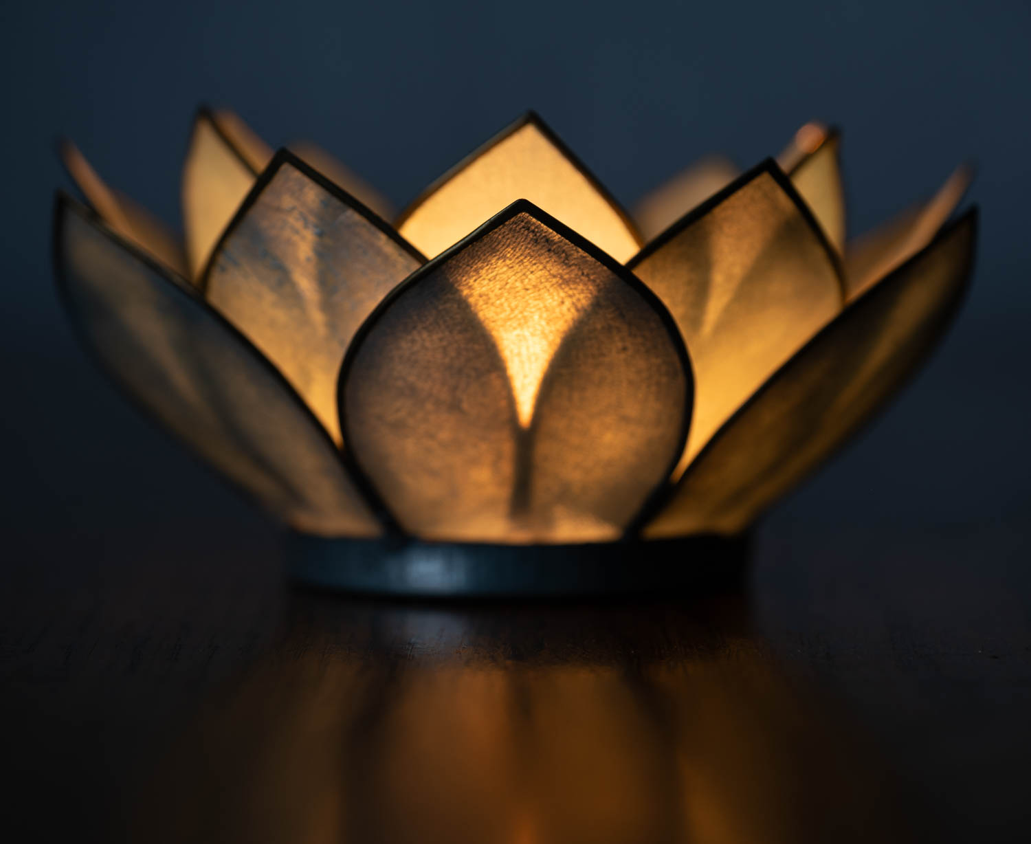
This was fun. My first attempt at a studio still life.
ocoloy print 29 08/01-23
The item is a kind of a bowl for candles that my wife bought a few years ago. I have always liked how they look, and how the candle shine through the semi transparent leaves, so I decide to have a go at it.
The orange light from within is just the candle. I had to use a fairly long exposure to get it right. I put up a grey cloth as a background, but it ended up all black, so I flashed my Godox AD100Pro at it. It was fun to be able to adjust the tone of the background using the flash power. Next I decided to put a flash on the item itself to lift the underside a bit. I put a flash with a softbox very close on the left side. You can see the cold light on the base, and on the leaves on the left side. I went for a very subtle effect since I wanted the candle to dominate, and I wanted to keep the reflections in the table. I spend quite some time on tuning the flash power and balancing the candle exposure using the shutter speed.
The result? I’m happy. I managed to use the flash to improve the result without being obvious. It is not merely a product shot as I think it has some mood to it.
Could I do better? No doubt, but to my untrained eyes I can’t think of much. I think I could have added another flash on the right (or a reflector) to get a tiny accent on the right hand side of the base as well, but that’s about it. Maybe I’ll see more options later.
This is a very different type of photography than I’m used to. I have never “created” an image in this way before. I have always found naturally occurring subjects. Either in nature, or objects left there by other people. To pick up an object and then building up an image from that is something completely different. And it’s fun. It is more like drawing or painting. Most of photography revolves around removing unwanted stuff, but here it is the opposite. Even light is something you add yourself.
They always tell you to photograph the stuff you love, and I have always found that a bit frustrating. I hasn’t really worked for me before. How do you identify the “stuff you love” in this context. For some it can be as simple as; they love horses, so they photograph horses. For me, it’s a bit more elusive.
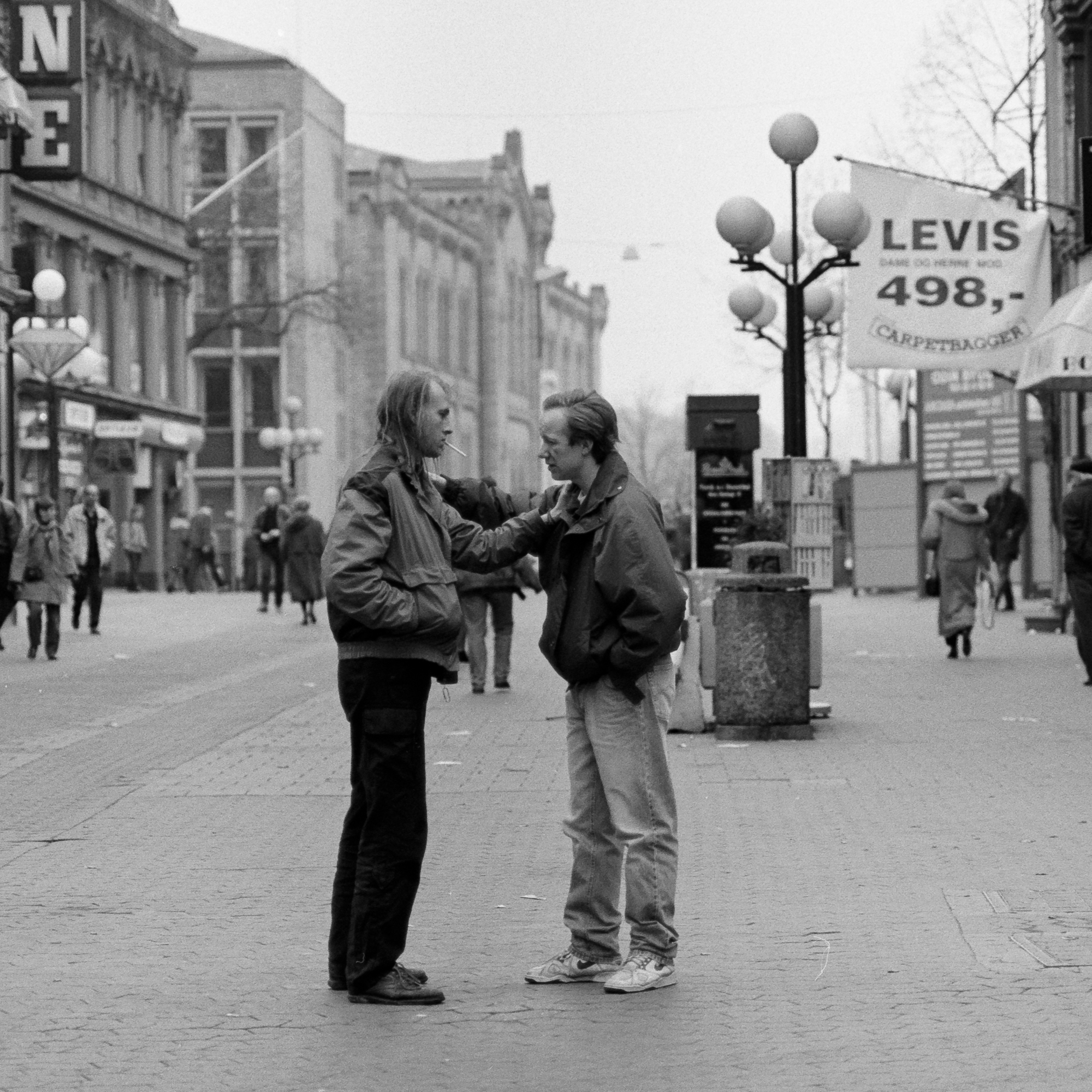
This summer it dawned on me that I do enjoy street photography. Why is that? Mostly because I like to watch people. How they look and what they do. I always do that when I’m out walking the streets or sitting on the subway. It is however some way between just observing, and actually taking photographs. At least for me it is. But I try as best I can. The thing is, I didn’t realize this until recently. I have photographed street on and off for many years, but I didn’t know exactly why. And it only became apparent to me that I have done street quite a bit when I went through my library a few weeks ago.
A shot this one back in 1991.
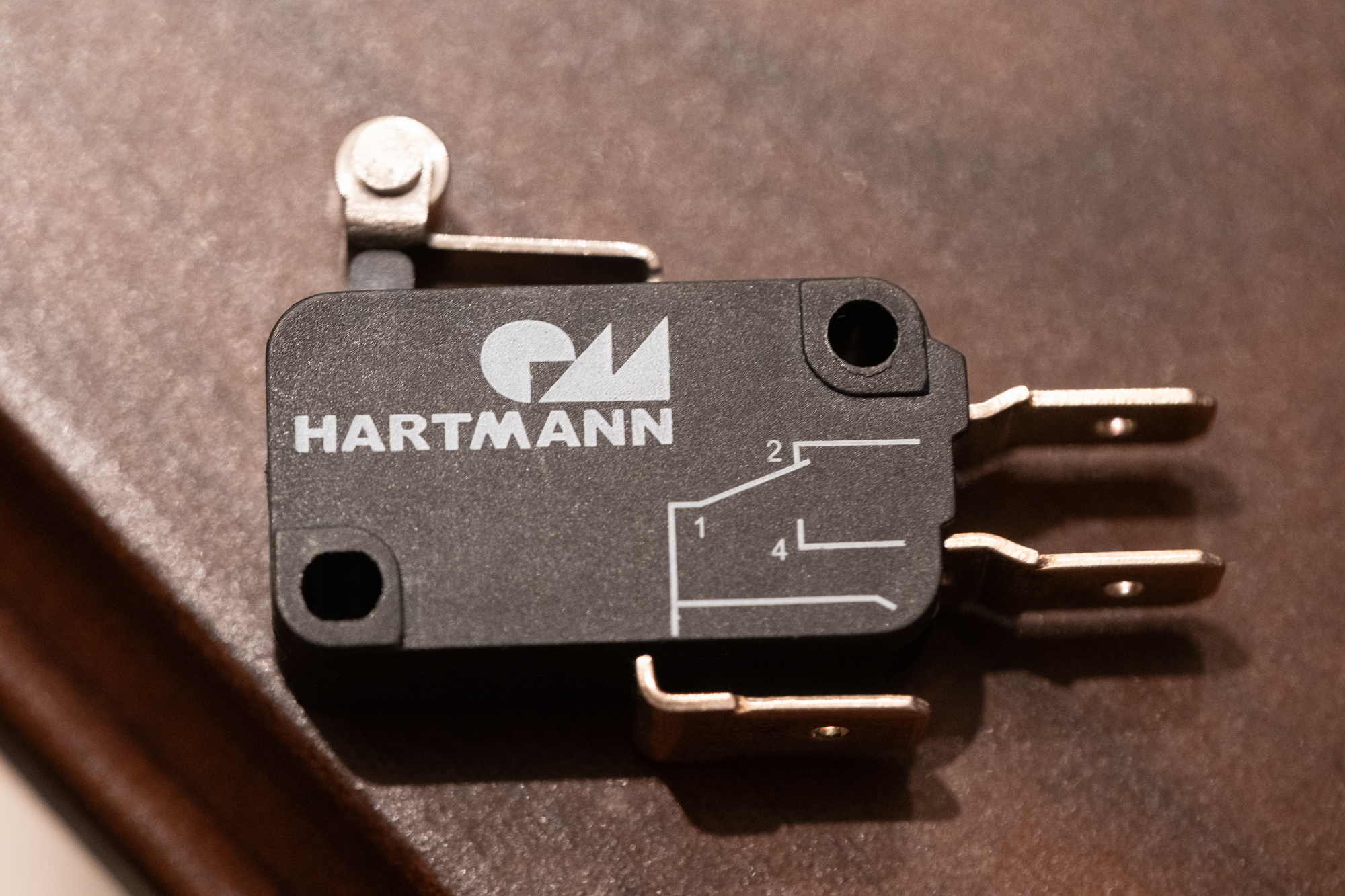
Then, just the other day, I realized another thing I always tend to do. This may sound strange, but I find a surprising amount of pleasure in various man made objects. Usually finely crafted things or precision mechanics, but it can also be old and weathered objects. Big or small, but most often small. I have stuff lying around just because I like to pick them up from time to time.
This small microswitch has been lying on my desk for at least 3 years now. Every now and then I pick it up, pushing the lever and enjoy the solid click and the smooth action. I also remember boarding a plane once. I had to wait a minute right in the doorway, and then I had a look at the hinges used for the doors on that plane. Beautifully machined parts that was custom designed and manufactured for that single purpose. I loved it. Why don’t I photograph all these objects? I don’t know, but I guess I didn’t connected the dots all the way to photography. Also, I don’t want to do straight product shots. It has to be something more. Maybe I was afraid of not being any original.
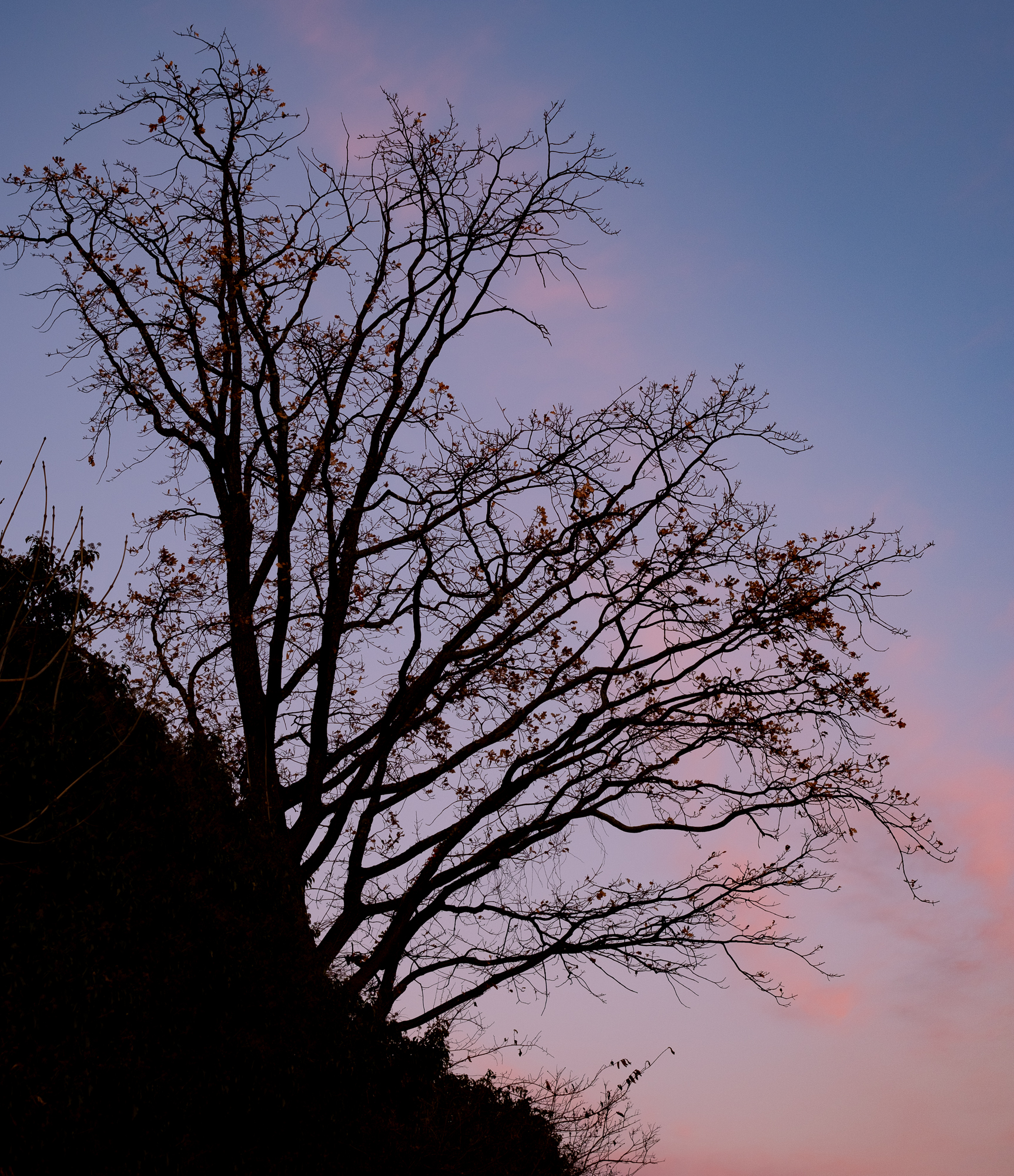
Another thing that dawned on me recently is that I really love threes in all its forms. Both live and … processed. This was also a thing that I realized by looking through my library.
ocoloy print 23 12/12-23
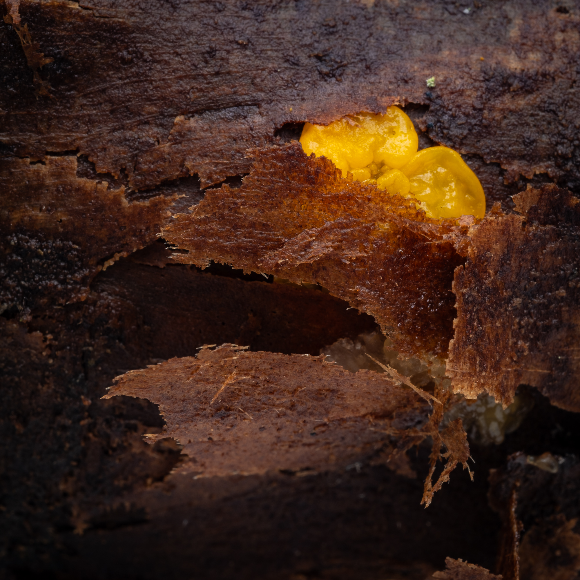
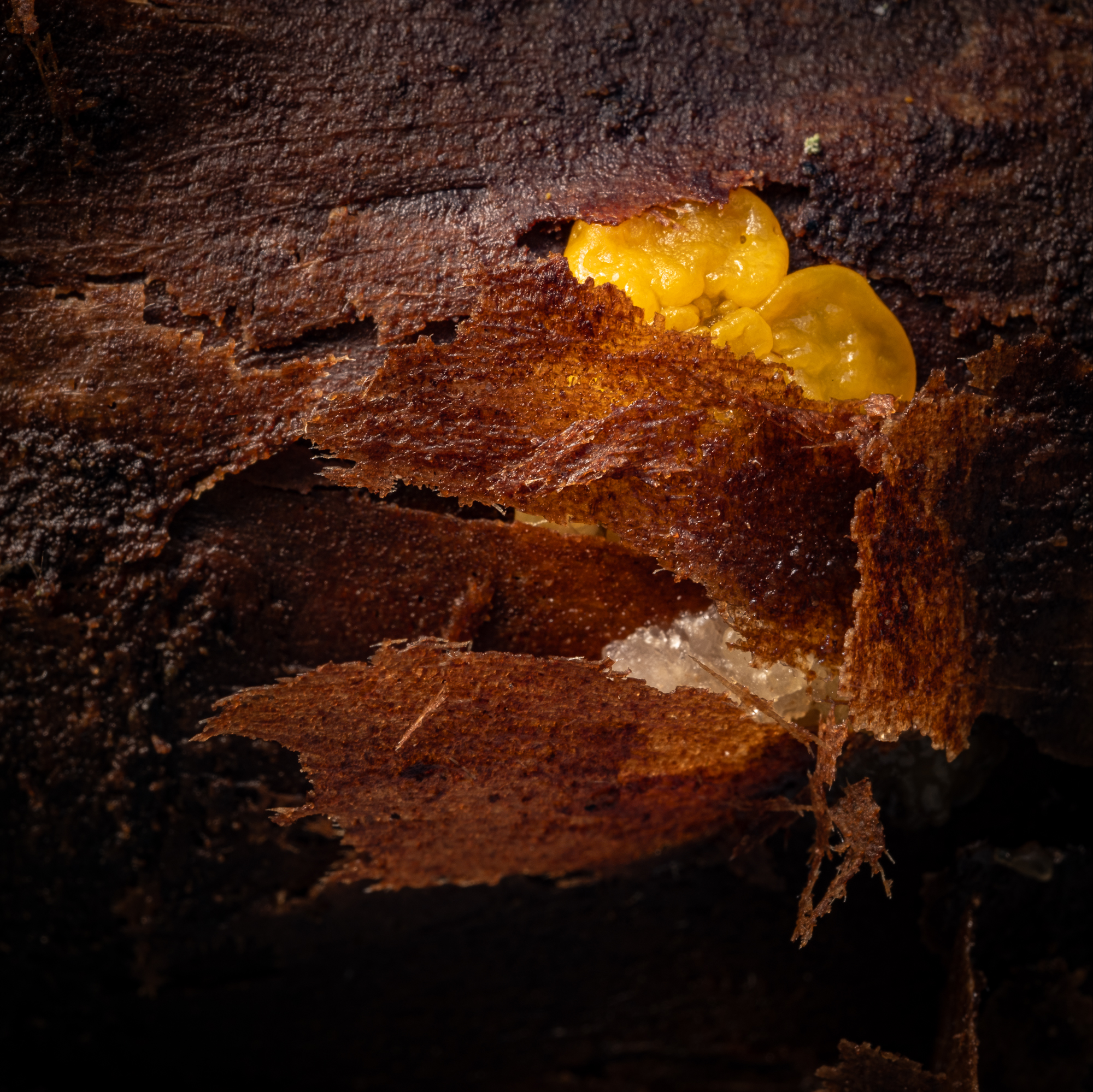
In fact I do find all the details and stuff lying around in nature (leaves, twigs, fungi, and so on) very interesting, but I find it hard to photograph. Light is often a problem in the forest, which often lead to boring images. And that leads me back to my recent introduction to off camera flash photography.
So, any conclusion to all this? Maybe. I find the recent realizations quite motivating, and I like that there are a variety of stuff. Streets are fun, but you need the time and opportunity to get in to the city. Nature …. well you have to get out, which is a good thing, but not always possible. At least not in daylight during winter. Small objects can be shot in an ad-hoc home studio, or on location. As long as I can find the time, there should be an opportunity. Also, adding my own light to the equation makes thing easier since I’m not always able to postpone my other obligations every time the light is optimal.
I have dabbled with Speedlight flashes before, and even got some decent results by bouncing off ceilings and so on. However, I have not tried it out for real. Flash equipment has been expensive, and I didn’t see how it would fit to my way of photographing. But now, two things have happened.
I found some really nice examples on using light in close-up/macro outdoors.
Off camera flashes has become accessible at a reasonable price (Godox).
So, to start off, I got myself a Godox AD100Pro and a wireless trigger for Fuji. I also got a silicon dome to put on the flash, and a small collapsible reflector. Wow, this was fun. Below is my first attempt. It was taken on a gray overcast day in the forest. The first image was the one I got without flash. I tried to develop it to a decent level, but I didn’t go all in. Just 10 minutes of Lightroom work.
The next image is a composite of two flash images. I emulated a two-flash lighting setup using one flash and photoshop. Notice how the texture is improved.
ocoloy print 24 17/12-23
I’ll definitely do more of this. Probably get a second flash unit and a couple of cheap light stands.
This has been an ongoing process for me for several years. When I started photographing in 1987, I only used B&W film. Partly due to the cost of color film, and partly because I enjoyed making my own B&W prints. I rigged a makeshift darkroom in my own bedroom, and had a lot of fun.
Fast forward to digital. For a long time, I have kind of thought I liked B&W most, but for some reason I have gravitated more and more towards color. It is fairly recent that I figured out that I mainly am a color photographer. But then there is that odd shot.
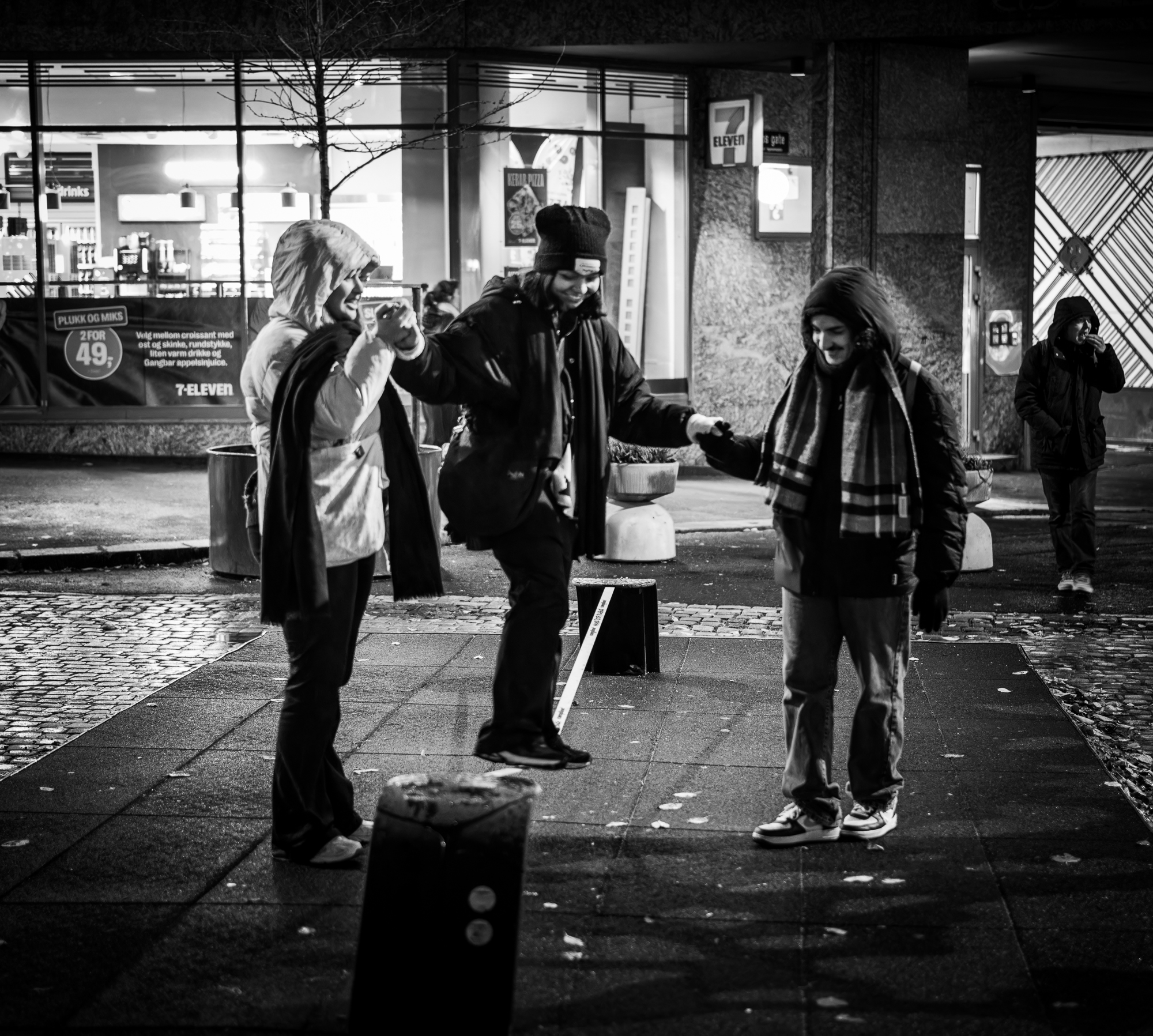
ocoloy print 3 9/11-23
I don’t think that one work at all in color. I B&W, the focus moves to the people in the foreground, while the 7-eleven storefront takes up too much space in the color version. I’m trying to figure out what I think about this. I’m not bothered about shooting B&W photographs, but I don’t like making that decision afterwards.
But all this is just me being silly. No one else is cares whether I planned a color shot or not, and whether I changed my mind afterwards.